
Google introduced a UI refresh as a part of the Android L developer preview at their recently concluded developer conference, Google I/O. A lot is being said about the new design language labeled “Material Design” and Google has provided extensive guidelines to help developers design their apps in this way, moving forward. A very important aspect of this design is unity, as Google’s VP of design Matias Duarte says:
We wanted one consistent vision for mobile, desktop and beyond, something clear and simple that people would intuitively understand.
Unity is important for Google as it will make it easier for users to access Google services through different devices. Surely, Google has taken design cues from both Microsoft and Apple in its material design, but it does not look like a patchwork of disjointed ideas- it seems very cohesive, and thoughtful.
It’s all about “Paper Craft”
Paper is the fundamental design paradigm of material design. Every pixel drawn by an application resides on a sheet of paper. A typical layout is composed of multiple sheets of paper.
Toolbars and menus can be configured to look and feel like papers on a notepad.
Depth as Hierarchy, not Ornamentation
In previous versions of Android and iOS an excessive amount of textures, gradients and shading was used which appeared overdone, disjointed and ugly. IOS 7 saw a radical change towards taking away all these superfluous graphics giving rise to a “flat” UI paradigm without any gradients, shading, etc.
Instead of going to extremes as is the case with iOS, Google has adopted a more subtle and nuanced approach. Material Design uses depth not as ornamentation, but as a way of communicating hierarchy and as a way to focus users’ attention to a task. Shadows can be added to aid the perception of depth and to highlight objects.
While the “Flat UI” paradigm is all about taking things away (gradients, shadows, highlights, etc), this new philosophy seems to be based on adding movement, animation and colors to spruce up the user experience.
Responses to Input
Until now, precious little was done in terms of providing users some positive feedback while interacting with the system/application. Material design incorporates visual and motion cues in an attempt to engage the user, providing input acknowledgement through animated effects that look quite refined, and not overdone.
Upon receiving an input , the system provides an instantaneous visual confirmation at the point of contact.
Use of Color
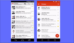
Android’s Gmail app, before and after the new Material Design interface.
Typography
Taking a leaf out of the Windows Phone UI playbook, Material Design seems to have a distinct focus on typography. The Roboto font, a mainstay on android devices ever since android 4.0 ICS, is modified slightly; it is wider and rounder in an an attempt to be more pleasing to the eye, especially since text is almost always white juxtaposed against a vibrant background in the main title bar of applications.

Simplified Icons
The trend of moving towards more simplistic icons instead of gaudy texture rich ones is pretty evident ever since android ICS and can also be seen in custom OEM skins like HTC Sense 6.

Each icon is now reduced to a minimal form, every idea edited to its essence. Even the navigation buttons have been reduced to geometric shapes. The designs ensure readability and clarity even at small sizes. Every icon uses geometric shapes, and a play on symmetry and consistency gives each icon a unique quality. Emphasis is laid upon consistency of icons for both mobile and desktop icons, and small details like rounded/sharp corners have been touched upon.
Focus on Imagery
 The focus on visual content is also very obvious on observing the new Android L design. The image takes center stage, and designers are encouraged to use vibrant and bright imagery without using stock photos. The focus on vibrancy of images has always been a part of the smartphone user experience, users prefer oversaturated images and vibrant colors in the photographs they take, they like colors to “pop” rather than look natural. The popularity of AMOLED display technology and display calibration by OEMs that favors the oversaturated over the true to life colors supports this observation.
Just like the Windows Phone UI, Material Design relies on images that go right up to the edges of the containing area without any window borders. It’s all big, bold squares/rectangles rather than icons and windows.
The “Card” Concept extended

Google has been shifting to the “card” user interface, a rectangle or tile that contains a unique set of related information. Cards are typically an entry point to more complex and detailed information. These cards or tiles have been a part of the UI in Google Now and a host of other applications like Google+. The way that these tiles update the user with live information is similar to Microsoft’s live tiles in the Windows Phone UI- for instance, showing the details for your next appointment on the calendar tile. Cards provide the user with summarized and glance able information and will be used extensively in the future as the focus on wearable technology increases.
Moving Towards Consistency
Google’s new design language is a good refresh, and brings a lot of good things to the table in terms of design. However, one of the most important aspects of Material Design is the depth and detail of the documentation and its systematic nature. After a long era of designers and developers creating Android experiences that often feel renegade or pieced together, Google have undoubtedly stepped up their efforts to standardize and improve the UI and UX across their app ecosystem. If it’s adopted, it’ll certainly lend a much-needed consistency to that world.
Keeps up with current design trends
Google is trying to incorporate uniformity by trying to get ahead of all of the screen sizes they have going now and provide some real structure. It seems they really tried to set up a fail proof way to design around all of the screen sizes, from the desktop experience to Glass to the watch. The effort is extremely expressive and is obviously about controlling the experience. Instead of trying to impose a strict visual aesthetic, Google defined a set of principles that leave more freedom to individual designers, while still pushing their numerous apps in the same consistent direction.
In Conclusion…
Many will see Material as a further extension into a flat era of design, in the same way Windows 8 and iOS 7 use large areas of solid color and wide open spaces with a focus on typography. I think it’s more than that – the current design trends are the only sane way to support a wide range of display sizes, ratios, and pixel densities. Physics, animation, and some of the layering effects are only now possible because the hardware allows it to be. The new design has elements that dynamically shrink and expand, adds more white space between elements, offers lots of animation, and provides a more 3D look emphasized by shadows and lighting effects. It’s designed to put the emphasis on the most important content of a screen. Although these are just visual effects today, they could be handy in future years with 3D displays and the possibility of tactile touch screens that actually raise portions of a display.
Maybe this is Google’s way of filling the void left by the demise of richly textured skeuomorphic designs? In any case, we can only hope it will add a little warmth and humanity to digital design and save us from a world where every app looks and behaves the same. Overall? I like it, I’m glad it’s here, but I don’t find myself bowled over by any of the components of the new system. It’s a well-considered stride in a necessary direction. I see this a great effort forward in laying the groundwork for a very Google-driven future ecosystem.
The video below reveals how the Material design language works across all devices Google touches, from smartphones to Glass to wearables.
 ShriViews
🙂 Great post .. According to Google Android L gonna be android of everything. It will combine cars, gadgets, wearable and the like.
LikeLike
Yes, as I mentioned, Google is moving towards creating a uniform UI for all screen sizes and form factors. Whether this effort is successful and effective in the long term, only time will tell…
LikeLike
I think it will be successful. I read their patents and they are launching lot of apps. Moreover other companies like Samsung has also started working on the same.
Check this link – http://greybmusings.wordpress.com/2014/07/03/smart-phonebook-of-samsung-combining-phonebook-plan-organizer-and-gps-with-your-car/
LikeLike