
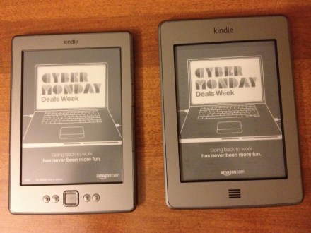
I recently got the new Kindle Paperwhite for a relative. Before I handed it over, I had the chance to use it for a few days. It uses a touch based interface on an e-paper display. However, there are no buttons and the interface is navigated entirely using the touch screen. After I handed the Kindle over, I also got a chance to go hands-on with an older variant. This used buttons for navigation. After using both, I felt like I should juxtapose both these experiences and talk about what in my opinion would be the ideal user experience when it comes to interacting with e-readers.
Feedback and Reliability
I personally felt that the older Kindle’s button based interface was much easier to use, and also much better in terms of user experience. As to why I feel like the experience is better, the answer is simple- physical buttons have certain affordances that a touch screen only system cannot provide. Affordances are aspects of an object’s design that suggest what you can do with it. This comes into play especially while using the page turn buttons that are mounted on the sides of the old Kindle. The buttons provide a tactile feedback that is reassuring. Tapping on a touch screen does not provide such feedback, unless there is a vibration or haptic feedback from the screen, which the new Kindle does not have. Another issue with the touch screen is that it is not as responsive as smartphones or tablets these days. Tapping to go to a new page does not work sometimes, and at times pages are skipped. The buttons not only provide reassurance and feedback, but they are also more reliable in this case, as the user can be sure that they have gone exactly one page ahead or behind based on the button pressed.
Faster Interaction
Another issue with the touch based interface on the new Kindle is that the navigation options are hidden by default in the “reading mode”. The top of the screen has to be tapped in order to access the navigation menu. In comparison, the old Kindle’s buttons are always out of the way of the screen, and are accessible at all times. This means that the button based UI has one less step when it comes to navigation. For example, if a user wants to navigate to the home screen, on the old kindle he/she just has to press the home button, while on the new Kindle they have to tap the top of the screen to make the navigation bar appear, then tap the home button to go to the home screen. This may seem like just one more step, but it can add up really fast in terms of user frustration.
One handed use
Side mounted buttons to turn pages on the old Kindle make it easier to use it with one hand. Having to tap the screen with one hand while holding the device in the other hinders and in many cases completely eliminates one handed usability. As this blog post says, one handed usability allows one free hand to eat popcorn or chips without leaving grease on the screen, for example.
On the flipside
Buttons do have disadvantages though. They might add to the overall expense of the device. As they are physical objects, they are subject to wear and tear over time. They also add to the overall bulk of the device and may be undesirable for people who value sleekness of the design over ease of use.
The best of both worlds
With the exclusively touch based interface of the new Kindle, Amazon seems to have decided to go button-free for the future. There is a way where both approaches can coexist. Amazon could include Bluetooth connectivity with the next Kindle. This opens up the possibilities of connecting keyboards and other devices to the Kindle and allow the users to use a button based navigation over the touch screen. A Bluetooth enabled case that adds the side mounted page turn buttons would be a great idea. Allowing the user to choose their preferred way of interacting with the device would be the best pro-consumer way to make sure Amazon can retain their sleek button-free design without un-solving a problem that was solved by the buttons in the first place.
