Microwave Ovens, product design, and human factors

I recently got a new microwave oven in my apartment after the old unit gave up the ghost. I wasn’t a big fan of how terrible the controls were on that thing, and the newer “better” model has an even worse interface. I began reading up on this online, and I saw some very good points being raised in various discussions.

First I came across the post “Why do most microwaves have such a terrible user interface?“. It does a good job of stating the problem. To summarize:

  • Most microwave ovens have too many buttons on them
  • These buttons have little to no tactile feedback
  • As a result, microwaves are difficult to use quickly

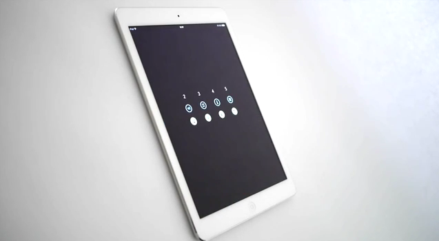
The blog post gives plenty of examples of good and bad user interfaces, which I suggest you should look at. The blog seems to suggest that the old system of having analog dials was much more elegant and simple. I also agree with the fact that a lot of the buttons on microwave ovens these days are superfluous and the most frequently used functions are very few. The writers argue that the rotary dials solve the problems of too many features confusing the user, and the lack of tactile feedback.

2015-11-17

I only use 5 of the 25 buttons on this panel.

A valid counter-argument towards having few buttons and/or dials, is that while they make the interface more simple and elegant, it may come at the cost of appearing to be too simple. “What if the user does not buy the product, if he/she perceives the product as not having as many features as the other microwave ovens out there?”. That is, feature discover-ability. Marketing teams and Engineers come up with and implement various ideas, to make their product seem unique, as they are all vying for the attention of prospective customers.

Another point to be noted, is that there is often a difference between what a user says they want, versus what they actually look for while buying a product. Sure, people may say that they prefer to have simple and elegant user interfaces for their appliances, but when it comes to making a purchasing decision, they will surely look at the different features that every product has to offer.

The argument that dials are better than buttons itself needs to be examined as well. Let’s take the example of microwave popcorn. A microwave oven may have a popcorn button, or it may have just a rotary dial. Microwaves vary in power levels and specifications, and there’s no set standard when it comes to how long it may take for your particular oven to properly heat the bag of popcorn without burning it. More often than not, this leaves the user with the option of trial and error. One or two bags of popcorn may have to be sacrificed before the user understands the time their particular microwave takes to heat a bag of popcorn.

So, the popcorn button isn’t exactly reliable. But what about the dial? Suppose the user wants to heat the bag for 90 seconds, but the dial does not allow finer grained time settings, that restricts user choice. The user is left with performing extra operations like constantly monitoring the time elapsed, and stopping the oven at a particular instant manually, supposing that a manual stop function is available.

There are clearly some important discussions that come up from this:

  • Simplicity of Controls vs Discover-ability of features
  • Simplicity vs Functionality

The blog post titled “A Lesson in Control Simplicity” has a great comment thread about these discussions.

To summarize, there seem to be too many steps involved while using a microwave oven these days, which makes one think that perhaps a simpler approach is what’s required. The buttons are flat, and give no feedback whatsoever. A dial seems to be very simple, but it may over-simplify.

flow_man_machine

The Human-Machine interface. How much should the user do, and how much should the machine do? That’s the important consideration in every case.

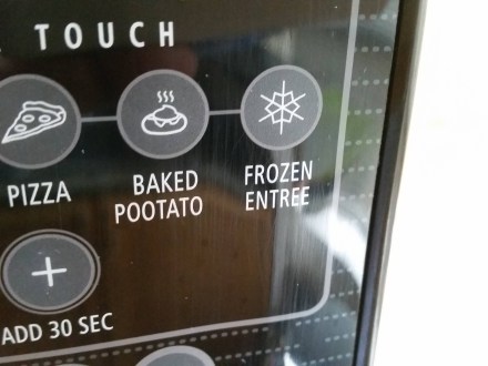
Perhaps there’s a need to put more thought into it. Maybe we shouldn’t try to design a microwave oven interface that does absolutely everything for the user. To go back to the popcorn example, most people just hear for when the popping slows down, to turn off the oven. It’s not all bad to involve the user here. What if the user was just given the option to start, stop, and set a particular cooking time, and for flexibility, an add 30 second button.

The microwave oven made me think quite a bit about the factors that influence modern interface design. There’s a marketing side, an engineering side, and a design side. Clearly, there needs to be a significant human factors side as well.

Peeple, Self Presentation and Redefining “Weak Ties”

Peeple is an app that’s been in the news recently. It’s an app that would let people rate other people, publicly. There has been quite a bit of outrage about it on the internet, because of what it stands for, and the potential of disastrous things happening to people and their reputations. Let’s peel back some of the layers and try to see the implications of this concept.

What is Peeple

Peeple as I mentioned before is an app that would let you post reviews and rate other people that you know. You can post about others, and others can post about you. Just about anyone that knows you, your neighbor, colleague, etc. could simply give you a rating and write a review about you, like you would on Yelp.

You cannot opt out of this, meaning that if someone decides to post a review about you, it will be on the system. On the other hand, you would get 48 hours to contest any review that you have received.

And the internet responded

There has been considerable backlash on the internet over this app idea. (Not to mention they stole the branding of another legitimate business.) When it comes to presentation of self, nobody wants other people to control it. Our self image is something we are very conscious of, and we take immense care to maintain a particular public image. This image changes based on the context, or group of people as well. There are a lot of dynamics involved in social communication.

Presentation of Self in the age of Social Media

These days, most of us have profiles on numerous social networking websites. We use them to connect and communicate with other people, but that is a secondary purpose. The primary reason for these profiles to exist is to “claim your name”, to project an image of oneself on the web, via posts, communications, messages and so on. We connect with other people, and affiliate with groups and other such entities as a statement of intent. On a surface level, it is a communication platform. But beyond that, it is a means of generating and projecting a certain image of yourself on to others.

To this end, we are often careful of what we post, what we “like”, what we share, and with whom. We delete or modify posts in order to keep a certain image intact. We carefully curate our profiles, to varying degree. Some people take this more seriously than others, of course. But at some level, this curation of social profiles takes place.

Weak ties and Networking

Another purpose of social media is to create and maintain “Weak Ties” – as the name suggests, these are acquaintances, friends, etc. that are not “close friends” or family, etc. but are affiliated to you, often via other people. Friends of friends, acquaintances, people you’ve met at social events and so on, that you may not really know a lot about, but have heard of or met a few times. The “friend” metaphor on Facebook lost it’s significance a while ago, in this regard. We “friend” so many people on Facebook at times, that it is generally more like an extended network of people. Even LinkedIn is a connection based social network, which directly uses such metaphors as first second and third connections.

The significance of weak ties is that they are often very useful when it comes to gaining professional opportunities, or being a part of social and cultural events. Even more so than strong ties. The more people you know, the easier it is for you to “get things done”, so to speak. That’s why there are so many networking events and meetups where people meet new people and get acquainted with people for professional or personal reasons.

Peeple as a threat to Weak Ties and Self Presentation

Of course, the concept of a People rating app has obvious negative connotations. Most importantly, people that do not like you would be free to post negative reviews about you. People who are in competition to you might use it as a means to slander. Personal attacks could gain an even more potent dimension.

As I mentioned before, people spend a lot of time maintaining and worrying about their self image. The Peeple app would mean losing control over this deeply personal component of social engagement. There would be some that like the idea of things being thrown into chaos, and the added layer of tension that the proliferation of such apps would bring into society.

In the professional world, this may not seem to have a direct impact, however it may come up in employee and candidate background checks.

Creating new “weak ties” could thus become very difficult for people if there are certain ideological or preferential differences between people that would not have mattered if not disclosed. If your “character” defined by a star rating becomes public knowledge, it could lead to losing out on networking opportunities.

Peeple as an opportunity

As all of us have learned how to make social media work for us when it comes to presenting ourselves to the world, in time, people could also find ways to leverage apps like this for their own benefit. Tacit agreements between people regarding reviews is one way. Using these apps to heap praise onto prospective employers or other groups to influence their decisions could also be possible. This app could also be, therefore, assimilated into the pool of ways in which you project your own self image. Today we curate social profiles to create a self image, maybe in a future where these apps exist, we would have to curate these profiles through other people. People who know how to influence others directly or indirectly could use tacit agreements or discussions to mitigate the negative effects of any “bad reviews”. For example, if someone posts a bad review about you, you could ask someone to counter it by posting a good review, or posting a counter-review on the other profile. Perhaps, a reply to the negative review with some context, and leaving the viewer of the profile to make conclusions.

This is the side that the co-founders of the company would want us to see- a means of getting feedback from people you know, so that you can improve upon it and be the “best person you can be”. I personally don’t buy it, because it’s a pathetically simplistic solution to a complex topic of social interactions, which is inherently nuanced and contextual in nature.

Of course, this could get very messy very fast. This does have a “he-said-she-said” feel to it, kind of like some kind of high-school drama. If apps like Peeple do get into the collective mind-space of society, there would have to be tacit agreements as I mentioned before, not to use such applications. People could decide not to use this app, or to disregard any reviews left on them.

The idea of the Peeple app is inherently invasive. It could lead to proliferation of gender biases, race biases, and so on. It could lead to creation of inequality – an “elite” class and a “lower” class separated by their star ratings. It goes against the very fabric of modern civilization – the fact that there are certain unspoken rules, often called the social contract. A part of me really hopes people don’t fall for this obviously terrible idea of reducing a person to a number value, but another part of me is really intrigued to see how society would adapt and react to this if it were ever to see the light of day.

Routines and the Quantified Self

What is the “Quantified Self” ?

These days some of us or quite a few of us try to capture certain minute details about our daily lives in a digital format. We keep a track of the amount of steps we have taken, the amount of calories in the meals of the day, and so on. The aim here is to keep a track of these things so that we may reflect, analyze and learn about what is going on with ourselves, to eventually improve ourselves over time. This has become much easier due to smart devices and wearable technology. Each and every one of us is generating tremendous amounts of data about ourselves every single day. Systems like the Nike Fuel band, the FitBit and even Apple and Google’s fitness oriented application suites want to take advantage of this current trend.

At the heart of this new “Quantified Self” movement are tiny, inconspicuous sensors embedded in various devices, that help record and log surprisingly accurate and incredibly detailed information. These sensors, combined with ubiquitous computing that allows these numbers to be crunched and presented to the users in an easy to understand format, and social networks that allow the users to share and collaborate, form the core of the new “revolution” in health and wellness oriented experiences.

Although all of this is a great example of how the latest technology can be used for our benefit, the idea of the Quantified Self is not as completely new as one might think. We have been keeping track of ourselves in various ways long before the advent of miniaturized biometric sensors and portable smart devices. Certain things like keeping a track of spending, or stepping on a scale every morning, have been a part of our lives for quite a while now. What’s new is this increased need for self-knowledge, helped by the rich and detailed information that can be recorded about ourselves.

Of course, there are still a few issues with the whole Quantified Self movement. One of them is keeping the user engaged. These systems currently require the user to constantly monitor or observe the information daily or over time. This may lead to information overload, or confusing the user because of too much information. Another is keeping the user motivated and interested in the system. It is observed that after a while a lot of people tend to revert back to their old ways because they get bored or lose motivation, and their fitness trackers end up in a desk drawer.

Routines

One of the things I realized as I read and researched about human factors, is the importance of routines in our daily lives. Certain things we do, certain actions that we perform, are so familiar to us that we do not spend too many attentional resources to complete those actions. They become “routines”. We continue to follow those routines until something unusual happens.

To understand how we can make the above mentioned Quantified Self systems better, we need to understand how to design them better. That’s where the understanding of routines comes into the picture. If the systems become a part of our routine, completely non-intrusive without too many requirements on our attention, they might just become better experiences.

Today’s solutions

Designers have tried to work around the issue of keeping users motivated in the case of fitness tracking. Gamification, or adding game-like interactive elements such as competition with others in your social network, trophies or achievements for achieving goals, or Role-Playing Game like elements such as character creation and progression, have all been tried out. The problem here is that it lacks a universal appeal to people. Some people really like Gamification, and others can’t be bothered with it.

Other attempts at helping users maintain motivation have been actual monetary incentives, such as the “Pact” app that allows you to bet money on whether or not someone will complete their fitness goals, or the “PavLok”, a wearable device named after the Pavlov experiment, which literally gives the wearer an electric shock if he/she does not complete the pre-decided goal.

I believe that the solution lies in understanding how routines are created, maintained and modified. Creating a new routine or modifying an existing one is difficult compared to maintaining an existing one, because changing certain habits takes conscious effort and attention. It takes a few cycles of the routine to fully internalize the changes. If it is too difficult, the individual may revert back to old habits. Superficial motivation like Gamification may not provide enough incentive to the user, to completely change their routine.

What I feel would be the ideal experience:

One of the key aspects of the quantified self is the focus on the individual. Self improvement, and detailed information that is specific to the individual are the key points of this whole experience. Using pre-set goals like “10,000 steps a day” thus seems counter-intuitive to this point. If every person is different, then every person should have goals as per their requirement, or their capacity. That is where biometric sensors fall short, and human intervention provides a more suitable solution. Sometimes it’s better to jog or run until you can feel your legs tiring out, for example, rather than just stopping after 10,000 steps every time.

That is where I feel this system needs to improve not only simply recording detailed information, but also to help create routines, and help you find your own way of making the best use of the sensor data. Information that can help you improve upon your fitness by showing you how much you can do, and what you should do to push your limits. The user would know when they have done enough, when they can feel it in their own bodies, without the need of a 3D avatar of themselves telling them they did a good job.

Ubiquitous Computing- A Reflective Essay

Introduction

This course “Experience Design for Ubiquitous Computing” has had a focus on both the social and the technical aspects of Ubiquitous Computing, and how User Experiences can be designed keeping in mind all the myriad considerations. We began this course by looking at what was to be the lynchpin of the rest of our journey- Mark Weiser’s vision of the Ubiquitous Computing future [1]. We are arguably two thirds or so of the way there and his vision has materialized in some way albeit not exactly as he had envisioned. Now I will attempt to show my own vision of the future, for the next few years and even beyond.

Beyond the Western UbiComp Worldview

One of the key issues that was discussed time and time again was how Mark Weiser’s vision and UbiComp literature in general seemed to revolve around western culture. Of course, this was addressed by Dourish and Bell in their book [2], but there weren’t any examples. I will attempt to explain how UbiComp technology and design affects the part of the world not focused upon by current literature.

A vision for UbiComp – Convergence of Current and Future Technology

Mark Weiser showed us all his vision of the future in 1991[1]. He envisioned multiple portable computing devices in various form factors, being cheap enough so that people would have many of them at hand and could trade them around like hall passes. One of the foundations of this vision is Moore’s law, which recently completed 50 years of existence. Added to that is the proliferation of big data- tremendous amounts of user generated data being created, collected and now even harvested in some cases. There are also some technologies at the fringes of UbiComp, like augmented and virtual reality. Allow me to show you my vision of the future, with all these technologies taken into consideration.

Moore’s Law continues to hold true, and scientists eventually find a means to miniaturize computing capabilities to such a small scale that it can be measured in a Nano scale. These devices will drive the next generation of Ubiquitous Computing. Often referred to as “smart dust” [8], this concept has far reaching applications in the future. I can imagine smart dust being deployed in farmlands and agricultural fields, giving relaying soil nutrient and other such data to central governmental cloud services, from where farmers can get real time updates about their soil conditions whether they would need fertilizer, etc. This may ensure that farmers would not require to learn about complex systems for computing.

This brings us to the future of location and context awareness. [3, 5] One of the major changes that I see happening is the proliferation of augmented reality. I envision the use of this technology in a scenario that not many pay close attention to, the field of social networking and social media. If you observe what social media giants like Facebook are doing these days, you will observe a heightened interest in big data, and augmented and virtual reality. Facebook’s acquisition of Oculus and messaging platform Whatsapp is proof of this. In my opinion, Facebook’s mission for the future is to permeate into every aspect of an individual’s life. A person wakes up in the morning, his smart device by his side, a multitude of smart dust sensors scattered all around the environment. Wearable devices tell him he should get something to eat, because his blood sugar levels are quite low. His sleep pattern has been erratic over the past few weeks due to an upcoming work deadline, and he can see this through a head mounted display. Wherever he goes, the head mounted display [4] provides him up to date contextual data about the surroundings, his neighborhood, and allows him to take pictures simply by blinking his eyes. This technology brings forth an exponential increase in the amount of user generated data on social networks, with some people allowing social networks to showcase each and every minute by minute detail of their lives, and Facebook provides the facilities to do so. Increase in computing power allows people to live stream to hundreds or thousands of people at once through their phones or their wearables, be it talking to family, or a social gathering, or simply just entertaining personalities who use this as a means to reach out to their followers and perhaps gain some revenue through online payment mechanisms.

One of the major sectors to be influenced greatly by the proliferation of ubiquitous computing will be education. In ancient times, students would get individual attention from teachers.  This kind of teaching was reserved for the upper echelon of society of course. After the industrial revolution, the modern metaphors of classrooms with class teachers and tens if not hundreds of students being taught by one teacher became the norm. The internet brought about a revolution called e-learning. People of all ages could now access eBooks and video lectures from around the world. However, I feel that in the future, the confluence of contextual awareness and an exponential increase in the data available to people will bring about the next revolution in education. Children these days have access to smart devices with internet connections, and they are able to search for things simply by typing in queries in search engines. The rise of UbiComp based design will create a new kind of education system, which would be like a personalized digital teacher. Like Alexander the Great had a teacher and mentor in Aristotle, children will have at their disposal a digital teacher that will teach them exactly based on the child’s needs, based on data gathered through wearables, communication via voice and other input modalities, and various other means. Parents will have a control over and will be able to keep a track of their child’s progress, and will know what their child is learning. Technology, if influenced by the research about child psychology, will be able to cater to even special needs children through this new system. These days we see e-learning platforms like Lynda.com, but they are limited in their effectiveness, as they are not personalized for each and every individual student.

Of course the usual question arises, “What about privacy? Will people allow technology to permeate into their lives to this extent?” I believe so. As Langheinrich [6, 7] said, about 60-70% of people fall under the category of privacy pragmatics. As technology continues to permeate into our lives, and marketers continue to sell smart devices, wearables and even services to the consumers, it will create a level of dependency on these services that we would perhaps find hard to get out of. Just look at our increasing dependence on Google services, for example. Most consumers and small enterprises use Google services for email, cloud storage and even collaborative documents. As this dependence increases, we will slowly allow more and more technology to permeate into our very lives, and we will become more accepting of it as well. Just have a look at how instant messaging has changed family dynamics. I frequently chat with my family on instant messaging platforms like Whatsapp, which recently integrated a calling feature. An immediate result was me getting calls from my distant relatives, just because it was possible. This is an integration of various affordances into systems that increases adoption and acceptance. This also means there’s an increase in the “messiness” of the whole system. Free market competition means that cross-platform communication will probably never be as seamless as some people would like. This can be especially important if we move forward to a vision of connected homes, with the “internet of things” concept.

Another aspect that is important is the energy requirements for powering all these devices. Battery technology has not sufficiently advanced, and techniques like energy scavenging [10] have not yielded significant improvements. This could prove to be a major stumbling block for the proliferation of UbiComp.

Speaking of stumbling blocks, one of the concerns I have is whether all the questions that we have considered over the course of the semester will even be considered by creators of UbiComp systems going forward. I have observed that many of the case studies have been a post rationalization of systems by researchers, to look at what was right and what went wrong. Will the major players in UbiComp consider the socio-technical challenges while creating new systems? In the ethnography discussion [9] Dourish and Bell show in a way, that sometimes introducing technology into different scenarios needs some analysis. Sometimes, you need to know when not to introduce technology, rather than how to introduce new technology into each and every new niche or domain.

Conclusion:

Ubiquitous Computing seemed like a field that was myopic in the sense that it was so heavy on western influences. The key focus areas seemed to be sensors, person tracking and connected environments like the smart home. However, the more that I read into it, especially the two texts “Ubiquitous Computing Fundamentals” and “Divining a Digital Future” that not only showed the technical but the sociological considerations of this field. Being on the cutting edge of technology, UbiComp poses some novel questions and concerns that are not apparent at a surface level evaluation of the field. Designing systems for Ubiquitous Computing therefore should be in essence a multi-disciplinary approach.

References:

  1. Weiser, M. (1991).The computer for the 21st centuryScientific American 265 (3), 94–104.
  2. Dourish, P. & Bell, G. (2011). Contextualizing ubiquitous computing. In P. Dourish & G. Bell, Divining a Digital Future: Mess and Mythology in Ubiquitous Computing(pp. 9–43). Cambridge, MA: MIT Press.
  3. Estrin, D., Culler, D., Pister, K., & Sukhatme, G. (2002). Connecting the physical world with pervasive networksIEEE Pervasive Computing, 1(1), 59–69.
  4. Starner, T. (2013, April–June). Project Glass: An extension of the selfIEEE Pervasive Computing, 12 (2), 14–16.
  5. Dey, A.K. (2010). Context-aware computing(Chapter 8, pp. 321-352). In J. Krumm (Ed.), Ubiquitous Computing Fundamentals. Boca Raton, FL: Taylor & Francis/CRC Press.
  6. Langheinrich, M. (2010).Privacy in ubiquitous computing (Chapter 3, pp. 95–160). In J. Krumm (Ed.), Ubiquitous Computing Fundamentals. Boca Raton, FL: Taylor & Francis/CRC Press.
  7. Dourish, P. & Bell, G. (2011).Rethinking privacy. In P. Dourish & G. Bell, Divining a Digital Future: Mess and Mythology in Ubiquitous Computing (pp. 137-160). Cambridge, MA: MIT Press.
  8. Warneke, B., Last, M., Liebowitz, B., & Pister, K. S. (2001). Smart dust: Communicating with a cubic-millimeter computer.Computer34(1), 44-51.
  9. Dourish, P. & Bell, G. (2011).A role for ethnography: Methodology and theory. In P. Dourish & G. Bell, Divining a Digital Future: Mess and Mythology in Ubiquitous Computing (pp. 61–89). Cambridge, MA: MIT Press.
  10. Paradiso, J.A., & Starner, T. (2005).Energy scavenging for mobile and wireless electronicsIEEE Pervasive Computing, 4(1), 18–27. (doi)

FilmSite- Design by Contextual Inquiry

Description

The goal of this project was to design a system that could augment filmmaking capabilities with the help of Unmanned Aerial Vehicles (UAVs).

Requirements Gathering:

Our Project involved observing the setup, production, and post-production activities that take place during filmmaking projects. This included observing all activities related to videography, light and sound, Computer Graphics, and the synchronization between all these various aspects of the filmmaking project.

We observed the behaviors of the various people involved in the activities, their routines, and the procedures that were involved. We conducted interviews to gather more information about the various issues encountered while conducting activities pertaining to filmmaking. The constraints they had to work within were of importance to us. The observed environments consisted of film sets, office spaces, and Post Production facilities that had computer workstations.

Conceptualization through contextual models

We took note of all the artifacts used, and the methods involved with using them. Contextual notes were taken, and diagrams were made, which were then consolidated. Based on the information gleaned from the aforementioned diagrams, we envisioned certain designs and a storyboard was created collaboratively.

Flow Model

Below is a representation of the coordination, communication, interaction, roles, and responsibilities of the film crew.

H561FlowModel


Sequence Model

The step by step process of film production is described below in the sequence model. Intent, triggers, activities and breakdowns are discussed.

H561SeqModel

H561SeqModel2

Physical Model

Below is a model that represents the physical environment where the work tasks are accomplished within it.

H561PhyModel

Artifact Model

The artifact model gave us some insight into possible inefficiencies with using heavy equipment that requires power outlets and manpower in order to move. This gave us a little insight into how we could use drones in order to make some of these tasks less physically tedious and more efficient.

H561ArtifModel.JPG

H561ArtifModel2

Cultural Model

The cultural model reflects the close interaction among the film crew.

H561CulturalModel.JPG

Affinity Diagram

H561Affinity

Visioning and Storyboards

FilmSite is envisioned as an on-the-go visualization and film production tool that would allow directors, film crews, and post-production VFX designers to plan film scenes from any location, at any time that inspiration hit using a combination of real-world imagery and simple mock-ups. FilmSite will allow for scene and camera planning and instantaneous ability to share work through the application or by lending a mobile smartphone to another to view completed work.

H561Vision

The following storyboards illustrate scenarios of envisioned use:

H561Story1.PNG

H561Story2.PNG

H561Story3

User Environment Design

User Environment Design


Low Fidelity Prototype

H561LF1.png

H561LF2.png

H561LF3.png

H561LF4.png

H561LF5.png

H561LF6.png

High Fidelity Prototype

H561HF1

H561HF2


H561HF3.png

H561HF4

Interactive Prototype

http://invis.io/S82OVMYMY

Evaluation

Key Strengths:

  • Users appreciated the high-level intentions of the design idea
  • The 3D perspective in the pre-visualization was considered helpful
  • Ability to restrict the view to specific camera choices was extremely useful for multiple shot planning
  • Mobile platform is convenient for use when ideas come to mind, or you want to show ideas to colleagues by handing your phone to them

Key areas of Improvement:

  • Improved definition between sections that cater to different subsets of production (pre-production, production, and post-production)
  • Filming section is considered ambiguous, as  the entire application is designed for the process of filming
  • The exportation of the 3D environment in pre-visualization needs more clarity as to what it does
  • Show different angles of the 3D environment so perspectives can be seen within the prototype for better expression of the prototype’s intentions

FULL REPORT: You can view the full report, which includes all of the detailed information here: Full Reportbox_expand-512

Usability Evaluation – Craigslist

Description

An expert usability evaluation I conducted as a part of a team project, for a class titled “Usability Evaluative Methods”. We conducted heuristic analyses and cognitive walkthroughs as a part of the formative evaluation, after which we conducted a usability test.

The test was a comparative study of Craigslist and a competing website called Oodle.com. There were 5 tasks per website. Half of the participants started with Craigslist, and the other half started with Oodle, so practice effects were taken care of. The participants were asked questions in the form of a semi-structured interview at the beginning of the test, and were asked to fill out a post-test questionnaire consisting of a modified System Usability Scale (SUS), and a unique card-sorting session which helped us glean information about the participants’ thought process.

Formative Study- Heuristic Analysis and Cognitive Walkthrough

We conducted heuristic analyses and cognitive walkthroughs individually and combined our findings. Some of them were:

Craigslist Home page

  • The lack of categories order, Boring design.
  • Difficulties in changing location.
  • The search filters are not working.

Account page

  • Difficulty in finding the “create a post” option once logged in to account.
  • Difficulty in navigating away from the accounts page.

Search Results

  • Search filters do not work.
  • Search alert function not clearly explained.

Summative Study- Usability Testing

In order to diagnose areas of improvements, we tested Craigslist.org against a similar site, Oodle.com. We compared these findings with the usability issues we identified in our expert review. Some of our expert review findings were confirmed by the user testing and new issues were revealed as well. There were two evaluators present during each user testing session. One would facilitate the test. The other would observe. A total of 8 user testing sessions were conducted.

Task Descriptions

Each session included the following tasks for Craigslist.org:

  • Logging in to User Account
  • Post a Listing
  • Add an Image to a Posting
  • Search for an Apartment to Rent
  • Save a Search

Each session included the following tasks for Oodle.com:

  • Logging in to User Account
  • Post a Listing
  • Add an Image to a Posting
  • Search for an Apartment to Rent
  • Mark a Listings as Favorite


Summary of Findings

Here are a few graphs showing a summary of our findings:

CraigslistSUS

CraigslistTaskRating.JPG

CraigslistTimeOnTask.JPG


General Recommendations:

Here are some recommendations that we found as a result of our card sorting exercise:

  • Adding the text box where user can “Search by Location” that is used on several other classifieds websites
  • Adding notification about waiting time for processing new listing after the users had posted their new products. Currently website doesn’t notify its users that the new postings take about 20 minutes before they can be viewed by other customers.
  • Adding product location distance that shows users how far they will have to travel in order to pick up their purchase. Few websites, together with Google maps, are already using this feature.

Other Recommendations:

  • Restrained social media integration
  • Clearly labeled icons

FULL REPORT: You can view the full report, which includes all of the detailed information here: Full Reportbox_expand-512

My views on Google's new Material Design UI

Google introduced a UI refresh as a part of the Android L developer preview at their recently concluded developer conference, Google I/O. A lot is being said about the new design language labeled “Material Design” and Google has provided extensive guidelines to help developers design their apps in this way, moving forward. A very important aspect of this design is unity, as Google’s VP of design Matias Duarte says: 

We wanted one consistent vision for mobile, desktop and beyond, something clear and simple that people would intuitively understand.

Unity is important for Google as it will make it easier for users to access Google services through different devices. Surely, Google has taken design cues from both Microsoft and Apple in its material design, but it does not look like a patchwork of disjointed ideas- it seems very cohesive, and thoughtful.

It’s all about “Paper Craft”

Paper is the fundamental design paradigm of material design. Every pixel drawn by an application resides on a sheet of paper. A typical layout is composed of multiple sheets of paper. 

Toolbars and menus can be configured to look and feel like papers on a notepad.

Toolbars and menus can be configured to look and feel like papers on a notepad.

Depth as Hierarchy, not Ornamentation

In previous versions of Android and iOS an excessive amount of textures, gradients and shading was used which appeared overdone, disjointed and ugly. IOS 7 saw a radical change towards taking away all these superfluous graphics giving rise to a “flat” UI paradigm without any gradients, shading, etc. 

Instead of going to extremes as is the case with iOS, Google has adopted a more subtle and nuanced approach. Material Design uses depth not as ornamentation, but as a way of communicating hierarchy and as a way to focus users’ attention to a task. Shadows can be added to aid the perception of depth and to highlight objects. 

While the “Flat UI” paradigm is all about taking things away (gradients, shadows, highlights, etc), this new philosophy seems to be based on adding movement, animation and colors to spruce up the user experience. 

Responses to Input

Until now, precious little was done in terms of providing users some positive feedback while interacting with the system/application. Material design incorporates visual and motion cues in an attempt to engage the user, providing input acknowledgement through animated effects that look quite refined, and not overdone.

Upon receiving an input , the system provides an instantaneous visual confirmation at the point of contact.

Use of Color

Android's Gmail app, before and after the new Material Design interface.

Android’s Gmail app, before and after the new Material Design interface.

Typography

Taking a leaf out of the Windows Phone UI playbook, Material Design seems to have a distinct focus on typography. The Roboto font, a mainstay on android devices ever since android 4.0 ICS, is modified slightly; it is wider and rounder in an an attempt to be more pleasing to the eye, especially since text is almost always white juxtaposed against a vibrant background in the main title bar of applications. 

Simplified Icons

The trend of moving towards more simplistic icons instead of gaudy texture rich ones is pretty evident ever since android ICS and can also be seen in custom OEM skins like HTC Sense 6. 

Each icon is now reduced to a minimal form, every idea edited to its essence. Even the navigation buttons have been reduced to geometric shapes. The designs ensure readability and clarity even at small sizes. Every icon uses geometric shapes, and a play on symmetry and consistency gives each icon a unique quality. Emphasis is laid upon consistency of icons for both mobile and desktop icons, and small details like rounded/sharp corners have been touched upon.

Focus on Imagery

imagery-focusThe focus on visual content is also very obvious on observing the new Android L design. The image takes center stage, and designers are encouraged to use vibrant and bright imagery without using stock photos. The focus on vibrancy of images has always been a part of the smartphone user experience, users prefer oversaturated images and vibrant colors in the photographs they take, they like colors to “pop” rather than look natural. The popularity of AMOLED display technology and display calibration by OEMs that favors the oversaturated over the true to life colors supports this observation. 

Just like the Windows Phone UI, Material Design relies on images that go right up to the edges of the containing area without any window borders. It’s all big, bold squares/rectangles rather than icons and windows. 

The “Card” Concept extended

card-example

Google has been shifting to the “card” user interface, a rectangle or tile that contains a unique set of related information. Cards are typically an entry point to more complex and detailed information. These cards or tiles have been a part of the UI in Google Now and a host of other applications like Google+. The way that these tiles update the user with live information is similar to Microsoft’s live tiles in the Windows Phone UI- for instance, showing the details for your next appointment on the calendar tile. Cards provide the user with summarized and glance able information and will be used extensively in the future as the focus on wearable technology increases. 

Moving Towards Consistency

Google’s new design language is a good refresh, and brings a lot of good things to the table in terms of design. However, one of the most important aspects of Material Design is the depth and detail of the documentation and its systematic nature. After a long era of designers and developers creating Android experiences that often feel renegade or pieced together, Google have undoubtedly stepped up their efforts to standardize and improve the UI and UX across their app ecosystem. If it’s adopted, it’ll certainly lend a much-needed consistency to that world. 

Keeps up with current design trends

Google is trying to incorporate uniformity by  trying to get ahead of all of the screen sizes they have going now and provide some real structure. It seems they really tried to set up a fail proof way to design around all of the screen sizes, from the desktop experience to Glass to the watch. The effort is extremely expressive and is obviously about controlling the experience. Instead of trying to impose a strict visual aesthetic, Google defined a set of principles that leave more freedom to individual designers, while still pushing their numerous apps in the same consistent direction. 

In Conclusion…

Many will see Material as a further extension into a flat era of design, in the same way Windows 8 and iOS 7 use large areas of solid color and wide open spaces with a focus on typography. I think it’s more than that – the current design trends are the only sane way to support a wide range of display sizes, ratios, and pixel densities. Physics, animation, and some of the layering effects are only now possible because the hardware allows it to be. The new design has elements that dynamically shrink and expand, adds more white space between elements, offers lots of animation, and provides a more 3D look emphasized by shadows and lighting effects. It’s designed to put the emphasis on the most important content of a screen. Although these are just visual effects today, they could be handy in future years with 3D displays and the possibility of tactile touch screens that actually raise portions of a display. 

Maybe this is Google’s way of filling the void left by the demise of richly textured skeuomorphic designs? In any case, we can only hope it will add a little warmth and humanity to digital design and save us from a world where every app looks and behaves the same. Overall? I like it, I’m glad it’s here, but I don’t find myself bowled over by any of the components of the new system. It’s a well-considered stride in a necessary direction. I see this a great effort forward in laying the groundwork for a very Google-driven future ecosystem.

The video below reveals how the Material design language works across all devices Google touches, from smartphones to Glass to wearables.

Ingenious Touchscreen UI for Cars

An Ingenious "Eyes-Free" Touch Based Interface for Cars

Cars these days have a lot of features built in to “enhance the driving experience”. Radio sets, central controls, GPS navigation, CD players… and for every new feature that’s added into the central console, there’s an ugly, unintuitive, horrible user interface. On one hand you might have knobs, buttons and dials that can be used without looking, or you can have a touchscreen interface that’s a but better to look at, less clunky, but requires you to take your eyes off the road. There’s always a tradeoff between form and function, visual appeal versus ease of use. 

Touchscreens today

Touchscreen Interfaces on cars these days, too similar to the button/knob paradigm that preceded it.

Touchscreen Interfaces on cars these days, too similar to the button/knob paradigm that preceded it.

The touchscreen interfaces found on cars today are Skeuomorphic. They adhere to the same layout, the same design language and basically the same way of interaction as the preceding standard, buttons-and-knobs, changing only the input method, which is the touch screen. Skeumorphism is not a bad thing in and of itself, Resemblance to real world objects helps understand and learn things better, as is seen in smartphone operating systems today- iOS and android use icons, text and buttons to great effect. 

However, there is a great difference in the usage scenario here. Smartphones can get away with skeumorphism because the user of the device looks at the display, and not anywhere else, while operating it.

While driving a car, the driver’s attention needs to be on the road. Touchscreen interfaces, in the form that they are in today, can’t simply be ported over for use in automobiles.  Virtual buttons and knobs offer no tactile feedback, and the user needs to search for the button every time.

A new solution

Designer Matthaeus Krenn has created a touch based user interface that can be operated completely without

 A car UI that departs from traditional skeumorphism

A car UI that departs from traditional skeumorphism

having to look at it. Instead of buttons, icons, text or menus, the interface is based on the number of fingers used to touch it, and some gestures like pinching and swiping.  Dragging upwards with two fingers turns up the volume; dragging up with three changes the audio source. Four fingers controls temperature; five for airflow. Each has a unique sensitivity based on its function and can be triggered starting anywhere on the touch surface. Moving up or down with your fingers spread a bit wider offers an additional set of controls. All eight of these can be remapped to the driver’s preference.

This new UI seems totally built from the ground up specifically for touch devices. However, it will take some time and effort for users to train themselves and learn this new interface, something which the designer himself admits needs to be addressed in future iterations. The application is currently available only for the iPad, and can be downloaded here.

In the future…

This focus on building a new touch interface from the ground up is a welcome change, and a step in the right direction. New control methods can offer exciting advantages previously impossible. But they also come with their own set of challenges. 

Augmented reality is another aspect of human computer interaction that looks promising. A user interface that combines both touchscreen technology and augmented reality may very well be the way we interact with our cars in the future. Critical information popping up on the windshield of the car, or Heads up displays found in Sci-Fi movies and video games may not be a fatfetched prospect. The only issue here is that augmented reality displays on car windshields may distract the driver, defeating the purpose of it all.

What do you think is the future of automobile interfaces? Let me know in the comments!


stLight.options({publisher: “2814c680-1ca3-4692-a110-0627022150af”, doNotHash: false, doNotCopy: false, hashAddressBar: false});

var options={ “publisher”: “2814c680-1ca3-4692-a110-0627022150af”, “position”: “left”, “ad”: { “visible”: false, “openDelay”: 5, “closeDelay”: 0}, “chicklets”: { “items”: [“facebook”, “twitter”, “googleplus”, “stumbleupon”, “pinterest”, “digg”, “reddit”]}};
var st_hover_widget = new sharethis.widgets.hoverbuttons(options);