Bluetooth Earphones, User Experience, and Loving the Mundane

I recently broke my second pair of Bluetooth earphones in the span of one year, and that got me thinking about my experiences using Bluetooth audio devices over the years. 

The Start: Being forced to use Bluetooth Earphones

The first time I started using Bluetooth earphones was back in 2015. I was forced into using them because my phone’s 3.5mm headphone jack stopped working, and I couldn’t be bothered to send my phone over to a repair shop to get it fixed. I was in grad school back then and money was tight- I remember scouring slickdeals dot net and finding a coupon code so I could buy a no-name brand pair of earphones for ten or twelve bucks. 

My first pair of earphones looked something like this

Before then, I was exclusively a wired headphone/earphone user. I didn’t have to think about the experience of connecting headphones to listen to music – just plug and play. That’s where my annoyances started with going wireless. There’s an initial setup process that involves pairing your earphones and your phone. It usually involves pressing and holding a combination of buttons for some amount of seconds until you see some kind of LED indicator and/or hear a particular sound. You then have to find the device on your phone, go through the pairing process and hope it works. 

Over the years, the pairing experience has become more intuitive and convenient due to prior experiences, familiarity, and manufacturers trying to reduce the number of steps needed. 

Thinking back to using those first earphones I owned- I mostly remember them being uncomfortable to wear- they dug into my ears at times, and their shape and hard plastic construction meant that holding onto them, keeping them in your pocket, and even pushing the power button was pretty annoying. The sound quality was hollow and tinny. The battery life was decent. But I overlooked the shortcomings because they were affordable, and I didn’t have a choice. 

Learning to Live with and Love Bluetooth Earphones

As time went on and I switched phones, I ended up continuing to use Bluetooth earphones at least half the time I was listening to music. Being forced to use them had helped me understand the plus sides of going wireless- being able to listen while your phone’s kept away, or being able to use them more comfortably while working out, for example. 

Brainwavs BLU100

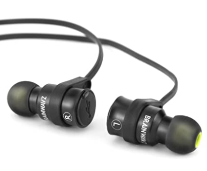
Graduating and getting a job also unlocked the capability of buying earphones that weren’t at the bottom of the barrel – that meant better sound quality, longer battery life, better build quality with more “premium” feeling materials, and better comfort. I remember using a pair of Brainwavz earbuds that came with foam eartips instead of the usual silicone ones. Using foam eartips that conform to your ears makes the experience of wearing earphones significantly more comfortable, especially for longer listening sessions. 

Despite becoming more accustomed to using bluetooth earphones, I still had a couple of issues with them. Connecting to a device wasn’t instantaneous, and turning them on required me to press and hold the power button for about 5 seconds. Not huge issues in the grand scheme of things, but when you compare that to the seamlessness of plugging a pair of earbuds into a 3.5mm headphonejack and starting to play audio, having to wait to turn on and connect wirelessly is slightly annoying. 

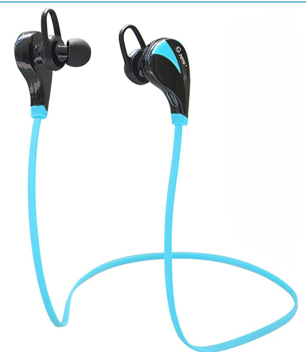
The unfortunate thing with bluetooth earphones- at least the ones I tried, is that they end up malfunctioning or breaking eventually. When my pair of Brainwavs kicked the bucket, I bought a pair of Aukey EPB40s. Design-wise, they were pretty much the same- except the left and right earbuds were magnetic, and were able to stick to each other- nifty to be sure, but nothing extraordinary. 

The EPB60s

It’s their successor, the EPB60s, that took the magnetic “snapping” feature and used it to switch the earbuds on and off- separating the earbuds to turn them on, and snapping them together to turn them off. What I first considered a clever gimmick turned out to be a great solution to the hangups I had with using wireless earphones. This was the closest that a Bluetooth device had come to seamlessly integrating into my routine. Sometimes the best designs are those that integrate so well into your lives and routines that you don’t even think about them. 

These were the first Bluetooth earphones that became my primary way of listening to music on the go. I still use wired headphones while listening to music on my “audiophile” setup- but that’s a whole different story. The ease of connectivity and the freedom of movement came together for the first time to provide an experience that just made sense. 

My Next Buy in a Changed Tech Landscape

Which brings me back to what I said at the beginning- My second pair of these just broke in the span of one year. Convenience is cool and all, but durability is pretty important to me too, which is why I probably won’t be buying another pair of these. Even if I wanted to, though- they seem to be out of stock or unavailable the last time I checked online. 

Apple’s AirPods probably had a lot to do with the true wireless trend.

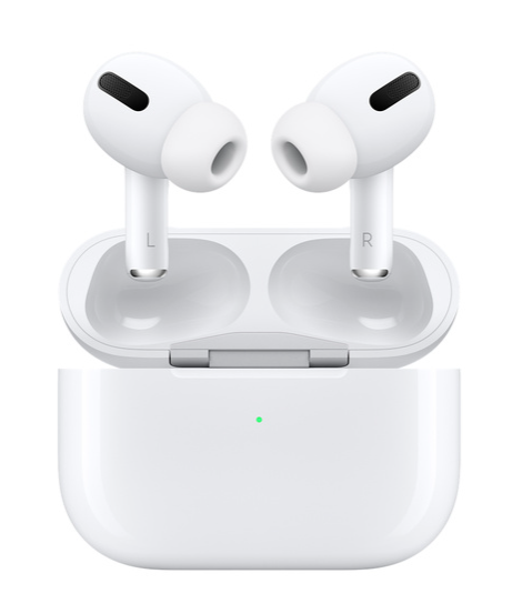
Another thing that happened in the past couple of years, is a significant shift in Bluetooth earphone trends. Namely, the rise of “true wireless” earbuds. I’m not sold on the concept personally- knowing how forgetful I can be sometimes, I just don’t know if I can reliably remember to place two separate earbuds into the same box, and not shove them into two different pockets, or keep them in two completely different places. They also tend to be significantly more expensive based on what I’ve seen. Replacing the usual Bluetooth earphones (What do I even call those now- “wired but wireless”? “False wireless”? “Old style”?) doesn’t sting me too much because they’re usually pretty affordable. Having to replace a relatively expensive pair of earbuds will hurt both my feelings and my wallet, and I don’t think I’m ready for that. 

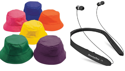
There is one alternative to “true wireless” earphones- like Juan Bagnell suggests in his video, “neckband” style earphones offer a lot more capabilities for a similar price. My issue with them is simple- they’re the bucket hat of earphones. Are bucket hats more comfortable than caps? Sure. Do they tend to offer more sun protection than caps? Yes, for the most part. Are they fashionable, cool, or sleek? For the most part- no. Unless you’re the kind of person that can pull off that look. Neckband earphones always strike me as functional but bulky, while true wireless earbuds stand out because of how sleek and low profile they are. 

In the end, I have a few choices. I could try to find the usual kind of earphones that I get, and replace them every year or two years. I could try the newfangled true wireless earphones and see how that goes for me. I could try using the neckbands and see if they really are as unwieldy as they appear. Whatever I end up choosing, it’s clear that this is a very mundane affair. Why then, did I write over a thousand words about it? 

Changing Preferences and Priorities as you Grow Older

Writing this helped me ruminate about how my tastes changed as I grew up. A younger me would have completely dismissed this discussion as boring and inconsequential. I was a lot more engrossed in the “bleeding edge” of technology back then, and wanted to experience the most enticing prospects in the world of mobile technology. The older I’ve gotten, the more joy I’ve started to experience in how well things integrate into my life. How things make my life more convenient. I get excited about new ways to organize my belongings in the physical and the digital world. Things like finding the perfect set of Tupperware containers, box organizers, shelves… even using an old can of peanuts to store my stationery because it’s just the right shape and size. In the digital realm, it’s more along the lines of password organizers, cloud storage, and faster storage drives for my computer. 

I see now that even something that appears seemingly mundane tends to have a lot of thought put into it- sometimes receding into the background of your life is exactly what the designers intended the thing to do. Sometimes what excites you isn’t how flashy something is, but just how it fits perfectly into your life, how it perfectly harmonizes with your routines and your muscle memory. I’d finally achieved a semblance of that with my bluetooth earphones that just broke. Now the question is not just about what I should buy, but it’s also about how well whatever I buy will fit into my routines, how intuitive it is for me to use, and in what ways will this new thing will allow me to experience that which I experience everyday? 

It’s Time We Re-Examined Aesthetic and Minimal Design

Let me know what you think about this video in the comments!

Here’s what I talk about in this video:

Let’s have a look at one of the most widely accepted and deeply held beliefs in the UX space and turn it on its head. I had this idea while thinking of Nielsen’s heuristics, mainly “Aesthetic and Minimal Design”. Let’s just start with the bundling aesthetic and minimal together. Why does it have to be that way? Clearly, it is possible to have something that’s aesthetically pleasing without it also being minimalist. If you look throughout antiquity you will see so many examples- The Meenakshi Temple, Angkor Wat, the list goes on. 

Of course, the heuristics are written from a usability standpoint. For the design of tools and services that are to be used to accomplish particular tasks. In that sense, it makes perfect sense to let go of excessive ornamentation if it interferes with the goal, which is the successful completion of whatever task is at hand. 

The issue I have with the laser focus on minimalism is when it bleeds into other aspects of life. As UX-ers, we’ve all been there. When we first get into this field, maybe you read the design of everyday things or some of those other staple books and you start looking at everything around you through the lens of design and usability. How many times have you come across something and said “hey, that’s bad design”. We’ve all been there, we’ve all done that. Some of us still do that, because we can’t help ourselves. And in many cases, it’s warranted- like when you have to park your car in a very confusing parking structure, for example. 

However, in many cases, it turns into a more tribalistic shaming of certain things. Let me give you an example from my own life. My mother loves having a house full of different stuff. Just collections of books or small trinkets or whatever it may be. She loves collecting stuff and changing the décor with the seasons and the festivals throughout the year. It’s always a very involved process for her- taking things out of boxes, putting them in particular spots around the house, and making sure every corner of the house has something placed in it. When I was younger and I was learning about minimalism, I used to think this was all very excessive and unnecessary- that it was inefficient and a waste of time, and that all this ornamentation was … just too much. That it was, well, not good design. 

Thinking back to it now, I realize that I was looking at it from a very myopic mindset. When my mother decorates the house every so often, she’s not creating unnecessary ornamentation. The whole process that I mentioned earlier is delightful in and of itself. UX-ers are always chasing the holy grail of “the delightful experience” all the time- we discuss it in every forum, in internal conversations at work, and so on. Anyway, the point is that a lot of things that bring joy to people are considered illogical or suboptimal when looked at through that minimalist lens. 

Let’s think instead from the “maximalist” point of view. Where it’s not “less is more” but rather “more is more”. Of wanting ornamentation, wanting every nook and cranny full of intricate details. A lot of cultural traditions are like that. In fact, I would even go as far as to say that the thought of minimalism as the only way for something to be aesthetically pleasing is a very euro-centric way of looking at it. The first things that come to mind are Scandinavian minimalism and to an extent Japanese minimalism as well. There are so many cultures that are not minimal though- I grew up in India and the dominant aesthetic sensibilities in my country are unapologetically maximalist, in my opinion. There’s also the phenomenon of minimalism as a form of cultural erasure- this is a more controversial stance which states that minimalism was used by authoritarianism to erase cultural heritages, from antiquity to modern times. In fact what people call modern design that was developed in the middle of the 20th century has that backdrop of authoritarianism and wanting to detach from the cultures of the past. 

As the field of UX becomes more international day by day, I think we as a community need to rethink the core tenets of our craft. We need to think about the overall contexts in which those rules were codified. I think that at least on the digital side of things, these heuristics that were formed in the 90s and 2000s were created when the internet and digital UX were in a nascent stage- when most of the creators and the end-users were limited to Europe and North America. 

So instead of shaming maximalism, let’s try to see how we can fully understand these different cultural and historical sensibilities and move our field forward. 

Thanks for watching, and remember:

Design IS political. 

Image of Clubhouse UI taken from their social media

UX Leaders Embracing Clubhouse is Emblematic of the Insular Nature of UX Discourse

I remember a quote from a professor of mine, Dr. Davide Bolchini. He said it in the first ever Human-Computer Interaction class I ever attended, back in 2014. He said, “UX is a field that always looks UPWARDS.” He then went on to recap the history of the field, its origins, and how it was built on the foundation of finding emergent technology and finding ways to incorporate it into a space in ways that utilized the strengths of the technology while keeping in mind Utility (does it meet a need?), Usability (does it lend itself to be used easily?), Desirability, and Brand Experience. 

Sometimes though, a laser-focus on simply moving upwards is detrimental, and the quick adoption of the Clubhouse app by UX thought leaders is a prime example of that. 

What is Clubhouse? 

Clubhouse is an audio-only social media app that’s aimed at professionals who want to have constructive conversations with one another. From what I’ve seen of it, it seems to have the structure of a moderated panel discussion: there is a lineup of speakers and an “audience” who can join-in and listen to the discussion, like listening to a podcast but live. There’s also the provision of allowing the audience to chime in, but there seems to be a moderator control aspect to it. 

To access this app, you need to have an iOS device (as of writing, it’s iOS only), and you need an invitation to be a part of this exclusive community. If that last part sounds like you’ve heard it before, it’s because you’ve probably already seen other services employ this model (Google+, for example). This article does a great job of explaining this strategic exclusivity: (Creating the Illusion of Exclusivity: The Story of Clubhouse)

Exclusivity and FOMO by Design

As the article I linked to above explains, the exclusivity is on purpose. It cultivates the Fear of Missing Out (FOMO) in people who want to get in, sometimes by any means necessary (people are selling invites on eBay, for example: (Clubhouse, a Tiny Audio Chat App, Breaks Through). 

This feeling of FOMO lies at the heart of my issue with Clubhouse being quickly adopted by so many in the UX community. Discussions in this field have always had the problem of being too exclusive and too insular- knowledge being locked away behind paywalls, in expensive books, and in conferences. To me, using an app that’s promoting itself on the basis of FOMO and platform exclusivity (iOS only!), is the grown-up, elder millennial version of the “green text bubble” phenomenon that’s observed in high school group chats that use iMessage. There, messages sent from iOS devices are indicated with blue text bubbles, and messages sent from non-iOS and non-iMessage enabled devices appear with green text bubbles. This simple design choice creates a social pressure among school students, who are quick to ostracize or make fun of students who don’t have iPhones, sometimes to the extent that they’re left out of group chats entirely. (Why iPhone users sneer at Android green bubbles in iMessage

Ben Bajarin’s twitter thread giving an example of the “green text bubble” phenomenon.

Counterpoints to the iOS exclusivity, and my thoughts on that 

The immediate counterpoints are that iOS exclusivity may have been necessitated by the nature of product development. This may be a staggered release -they’ve said an Android app is on the way in this statement, along with some other promises: (Clubhouse — 🎉 Welcoming More Voices)

Of course, developing and deploying products takes time, and there are complexities and considerations on each platform. However, I see no roadmaps, no estimated times of arrival, nothing. All I see are ambiguous promises. There is no way for me to know how many weeks or months I will need to wait to even be in the running to grab an invite thrown at me. Like I’m some caged animal desperately waiting for a piece of meat thrown at me by a zookeeper. 

Another counterpoint I see is that it really isn’t that long, just a matter of a few months at most. My answer to that is- it IS a lot of time. As I said before, UX is a field that constantly looks upwards. This field moves very fast, and if I don’t have access to the latest, most up-to-date discussions that go on, I stand at risk of falling behind and being out of touch. Yes, I know it’s called the “bleeding edge” for a reason, I know that being at the forefront of everything puts you at risk, but if I want to get cut by the bleeding edge, I should be allowed to do so. 

Conclusion- A feeling I am all too familiar with 

The immediate acceptance of Clubhouse as the de-facto platform for UX discussions has left a bad taste in my mouth. That’s not to say that this is something I have not tasted before. Ever since the day I took my first step into the UX business, I saw how many closed gardens there existed. How many small cliques, how much insularity there was everywhere I looked. Maybe in our quest to constantly look upwards, we didn’t realize that the field necessitated looking in all directions.

Leah Symonne wrote a brilliant article about “The Cult of Creativity” (The cult of creativity. UX Design doesn’t have to be your… | by Lena | Feb, 2021) where she talks about how much of the community is an echo chamber, a monoculture of people who all think the same way, who liken themselves as purveyors of some arcane wisdom, shunning all other lines of thoughts, pushing away all those who don’t want to make UX their singular personality trait. 

I’ve seen this insularity in the community first-hand, ever since that first Human-Computer Interaction class back in Grad School in August 2014. I experienced the sheer apathy meted out to me by the UX community for voicing ideas that were contrary to the established ways of thinking. I’ve been big-leagued by managers of the local chapters of UX-based community organizations when I expressed interest in helping them out. It’s all reminiscent of high school and college cliques- you are either part of them, or you know somebody who knows somebody that can get you in. They say high school never really ends, and that has been my lived experience. I was the invisible man in high school, they didn’t let me audition or try out for the college rock band because I didn’t know the right people, and now, as a UX professional, I’m being left out of yet another exclusive group just because I don’t have an iPhone and an invite. 

While I may be disappointingly used to being excluded by a community that ostensibly celebrates different voices- UX is truly a confluence of the most brilliant minds from a variety of different fields, spanning technology, the humanities, and a whole lot more- I am concerned that this is a sign of things to come. A dreadful portent of a future where there are even more subdivisions of this great community into smaller and smaller walled gardens. Where knowledge is locked down even more, and where everyone threatens one another with closed fists rather than welcoming one another with open hands. 

I hope we find a way to tear all these walls down before we all end up buried within them. 

[VIDEO] UX Research: Why Studying Other Interviewers Matters

Join the conversation in the comments!

I’ve been wanting to make videos about UX-related topics for a while. I was inspired to talk about learning via observing other interviewers, because I’ve been studying other interviewers for a while, I’ve been told that it isn’t useful, and I don’t agree. It all came together in my head as I was reading Steve Portigal’s famous book, “Interviewing Users: How to uncover compelling insights”.

Here are the key points I make in this video:

  • Interviewing is a skill: the best way to hone this skill is through practice, learning via experience. However, I have a question: Is there any value in learning by observing other people conduct interviews?
    • I asked this to a highly experienced UX-er, and the answer I got was “No, because there are certain intangible qualities certain people have, that you cannot replicate within yourself. You could copy what they do, but that’s just unnatural and forced.”
    • I don’t agree with this, because I am not trying to copy someone’s style. I am observing to see if there are certain things I can learn from interviewers that I can imbibe within myself, like a “formula” of sorts. The goal of observing other interviewers is to augment the key thing which is practice and improvement via direct, actionable feedback.
  • That being said, I don’t just observe other UX-ers. I observe interviewers in various industries. For example:
    • Therapist “Dr. K” From HealthyGamerGG. He has a knack for establishing a rapport with the interviewee, he knows how to steer and control conversations, and I learned a couple of neat tricks from him, such as pausing to think for a minute, and slowly sipping a glass of water during the silence portions of the conversation, to get the other person to speak.
    • All Gas No Brakes. What I learned from the interviewer here is how you can get people to let their guard down by amping up your “naive-ness”.
    • Great Radio and Podcast Hosts: What you can learn from them is how to keep track of narrative threads and how to pull at the right ones at the right times.
  • Lastly, this is personally important to me, because I moved from India to the US. A completely different cultural environment with different social norms. I don’t have any experience with working in customer or client-facing jobs when in high school or college, like a lot of people my age tend to have when they’re born and raised in the US. Observing interviewers helps me understand the different norms (turns of phrase, idioms, common topics for small talk, etc.) that I may not know right off the bat.

“Brainiac” and the Tesla-ification of a spirited driving vehicle

I’ve been obsessed with the Scion FR-S/Toyota 86/Subaru BRZ for years now. What interests me about it is that Toyota and Subaru committed to the purebred concept of the roadster, with front engine, rear wheel drive, and playful handling as the most important aspects of the design. This design philosophy also translated into a bare-bones, functional interior with minimal creature comforts and simple hard controls for climate and media. 

The bare-bones interior of the 86/FR-S/BRZ designed with spirited driving in mind.

Another positive for car enthusiasts is that the vehicle lends itself well to modifications- Toyota and Subaru knew their target audience would be car enthusiasts who’d love to tinker with their vehicle, and hence made it easy for them to access the mechanical and electronic parts of the vehicle. And tinker they did- a simple web search will yield hundreds of different possibilities, from headlights/tail lights to exhaust to wheels, even swapping out the engine!

Now, I spend a lot of time watching videos and browsing through forums for this vehicle- think of it as window shopping. As a result of this habit, one fine day the Youtube algorithm recommended to me a video about a new(ish) touchscreen head unit for the Subaru BRZ aptly named “Brainiac”. It is a touchscreen interface that combines the media and climate controls into one sleek-looking touchscreen interface. 

Brainiac uses a touchscreen interface sourced from tablet computers, and also comes with bits of fitment and interior panels in place of the components it replaces.

The “Brainiac” piqued my interest because I do a lot of research on automotive infotainment systems at work, and in our practice meetings we tend to discuss how perceptions of a vehicle’s “coolness” or “futuristic quality” end up being translated into “less buttons and knobs”; more specifically into “like the Tesla with its big touchscreen that has everything on it” 

As Human Factors Researchers we know that the trade-off of this “Tesla-ification” is that you lose the immediacy of access that buttons and knobs provide. To put it simply, hard controls like buttons and knobs may appear to be “old school” and “clunky”, but you don’t have to look at them to operate them, which lets you pay attention to the road. 

Paying attention to the road is an important aspect of the design of the Toyota 86- it is a roadster purpose-built to enjoy spirited driving. Cutting through canyons and navigating hairpin turns. Knowing how much grip you have through the tires because of how low you are to the ground. Turning the steering wheel and knowing that the vehicle will go exactly where you’ve pointed it. 

But that’s just my personal opinion- I wanted to know what the community felt about it. My thoughts about this are perfectly echoed by Reddit user TurbochargedSquirrel.

On the other hand, other forums seemed open to the idea of a touchscreen interface just to add a bit more flair to their vehicles.

This split is something we’ve seen in our research for a while now- people who prefer simplicity and want to focus on the driving primarily, and those who want all the bells and whistles that modern technology has to offer. My reservations with replacing traditional controls with touchscreen interfaces remain, but to the credit of the developers of Brainiac, they have added touch gestures to their interface to allow the user to perform actions without having to look. The issue I have with that, however, is that touch gestures usually have to be remembered, and do not have a visual component to them that the user can “follow along” or “trace”. 

So what’s the best of both worlds? What’s a way to maintain the spirit of driving intact while also moving away from old fashioned controls? Designer Kasper Kessels’ concept might just be a bridge between those two worlds. With help from the design department at Renault, he created a concept for incorporating touch gestures into a vehicle’s infotainment that aims to solve the issue of the visual component that touch gestures tend to lack. 

In the end, I’d like to pose the question to you- what do you think about the move towards “Tesla-ifying” in-vehicle infotainment systems? Are we attempting to fix something that’s not broken? Is there a way to create an interface that caters to both spirited drivers as well as technophiles? Let me know what you think! 

A few thoughts on “Using the Difficulty”​ in User Experience Design

Introduction

While looking through articles and examples of UI Dark Patterns, I stumbled across a paper titled “Use the Difficulty through Schwierigkeit”: Antiusability as Value-driven Design”. I was intrigued by the title of the paper, and the essay style used by the author.

On an initial read through, the paper felt like a meandering essay, which touched upon various aspects of the “Anti-usability/Schwierigkeit ” school of thought. A couple more read-throughs later, I was able to understand the various nuances within the points presented by the author.

The author really exemplifies the point he’s trying to make with the words used in the first couple of sentences. I mean, wording such as  “This aphorism also encapsulates the raison d’etre…” has to have been a deliberate choice.

Definition and Origins of “Using the Difficulty”

Antiusability is defined as

“…a novel way of design that centers on the finely tuned integration of graduated difficulty into user interfaces to systems in a variety of contexts.”

It’s important to note that Antiusability is not the opposite of usability, it is in fact part of usability and user experience design. Lenarcic makes note of this by suggesting the use of the term “Schwierigkeit” (which means “difficult” in German) as an alternative.

Lenarcic cites the example of Michael Caine, who asked the director of a play he was in, about how to deal with a chair that was on stage. The director told him to make use of the chair in a way that helped him express the nature of the scene (smashing the chair of it was a dramatic scene, or tripping over it if it was comedic). In this way the chair went from being an obstacle to an object that could be used in a productive manner.

Key Points

Here are the key  points that Lenarcic went over in his paper:

  • The usability of a device can modify a user’s behavior.
  • Difficulties can be used in such a way as to have a net positive effect.
  • Choreographing obstacles in a way that allows the users to regain the feeling of being in charge of the interaction process rather than being “madly addicted” to it.
  • “Calibrated difficulty in practical design to accentuate the greater good in system use”
  • How easy should things be? How difficult should things be to enable an end user to feel they have performed a useful task?
  • Regaining control over our lives- “slow” movement and moving away from hyper-efficiency as an end goal for all interactions
  • Exploring “viscosity” in user environments, affordances that allow resistance to local changes.

What follows is my attempt at summarizing and reflecting on some of the points presented in this paper. The paper was written in a meandering essay style and my thoughts tended to meander as I wrote this, though I have tried my best to create some coherent structure.

“Calibrated Difficulty”: Gamification and Homo Ludens

The author talks about “calibrated difficulty in practical design to accentuate the greater good”. My mind naturally went to levels of difficulty in video games. Games are a great example of difficulty being an important aspect of the user’s experience or indeed their enjoyment. Most games have different levels of difficulty to cater to different people’s preferences.

Today, gamification of interfaces has become a buzzword. “Gamification elements” have become synonymous with things you can tack onto an interface in order to make it more “delightful”. Things like leaderboards, scores, achievements, and badges. I feel like the benefits of adding such elements without proper thought is limited at best and questionable at worst.

I believe that this idea of using the difficulty has an application in truly gamifying a user experience. True gamification involves using aspects of the interaction itself, using the “Core Drives” of the user, as this article by Yu-kai Chou brilliantly describes. Imagine if you got a sense of accomplishment on completing a tedious task, rather than exasperation. (Something like, say, editing an image-laden document in Microsoft Word without messing up the layout.) Providing a challenge, timely positive feedback and competition can definitely act as motivational drivers as is described in this paper.

But gamification at its core still aims to improve the user experience with the goals of the user in mind. It is still about getting things done by providing a sense of accomplishment to the user for doing “grunt work”. Lenarcic’s Schwierigkeit is more in line with William Gaver’s “Designing for Homo Ludens”. As Gaver describes, his definition of “playing” is different from “gaming”

“Not only are these forms of ‘play’ fundamentally goal-oriented, but in striving for a defined outcome they impose rules about the right and wrong ways to go about things… Pursuing such an instrumental version of ‘fun’ does not help provide an alternative model for computing. On the contrary, it co-opts play into the same single minded, results-oriented, problem-fixated mindset that we have inherited from the workplace.”

Gaver goes on to provide examples of open ended forms of engagement with no fixed goals, rules or outcomes. He says that scientific approaches to design should be complemented by open ended and exploratory ones.

“It is difficult to conceive of a task analysis for goofing around, or to think of exploration as a problem to be solved, or to determine usability requirements for systems meant to spark new perceptions”

Regaining control over the experience- allowing the user to reflect on their actions

Another aspect of Lenarcic’s paper is about allowing the user to reflect and rest as they use the system, instead of having a singular goal of reducing the time on task and increasing efficiency. The more time you can save, the more work you will end up doing, as Landauer expressed in his book The Trouble with Computers.

He argues that allowing time to reflect over actions may help the user feel more in control over the system, as opposed to being “madly addicted” to the process. He argues that adopting a more mindful and “slow” approach could lead to more user satisfaction. Allowing users to reflect on their actions be used to improve learnability and understanding of the system.

A personal reflection on Usability, User Experience and “Delighting” the user

Usability discussions are often centered around ease of use, and when people talk about user experience the end goal is often times “delighting” the user. The end goal of UX design and research is always creating an ideal experience for the user based on their needs and behaviors. Words like simple, easy, desirable, and efficient are the ones that are used, while words like difficult always have a negative connotation.

This paper really got me to think- is making something easy to use, more efficient and less time consuming really the only way to improve the user experience? Can the difficulties inherent in some experiences be leveraged to a positive end?

Of course, there’s a difference between making something usable and making a delightful user experience. I feel like Lenarcic’s idea of “using the difficulty” has a place in discussions about the latter. Some may equate the ideal experience with the most efficient, but reading Lenarcic’s essay made me go back and re-read ideas like Gaver’s Designing for Homo Ludens, and made me realize that there’s a lot more to user experience or human centered design than simply designing for efficiency.

Thinking back to my days as in Grad School, I remember the discussions with professors and peers about ways to “delight” the user. It almost always ended up being about how the interface reacted to the user- beautiful transitions, animations, innovative 404 screens or other ways in which to provide information about system status, and so on.

There’s so much more to user experience and “delighting” the user than a focus on making things easier to use. Exploring, playing around with something with no end goal, some level of challenge, all of these are ways in which we may seek fulfillment. I’m glad I picked apart this paper despite my initial hesitation, because it made me go back and re-read so many things that I had forgotten about or was unable to appreciate because of the stresses of being a graduate student. This in itself is a case in point- I read all these academic papers with a goal oriented mindset, I wanted to extract their meaning, write a summary, and discuss them in class, all with the goal of passing my class, with the incentive of good grades (or the fear of bad grades). My goals were set, and I developed methods to efficiently accomplish the tasks of summarizing and discussing papers. It’s now that I have the time to reflect on these papers that I realize how important and thought provoking they are.

This paper reminded me of my initial wonderment about the human condition. I feel like I had lost sight of the complexities of the things that make us tick, and it’s refreshing to remove the blinders of efficiency and ease of use to look at things like difficulty from a new perspective.

What the Indian Spice Box can tell us about optimal menu design

In my two years of living in the US and having to make Indian food for myself, I have learned the importance of the spice box. At first, cooking Indian food seems like a very daunting and labor intensive task. The oil that is used for tempering has to be heated to the right temperature, the spices have to be added in a particular order, and in precise amounts. In this scenario, having a box that contains the right spices at one place is the ideal solution.  As this article in the Boston Globe describes it:

“Timing is key in Indian cooking. Many recipes begin by heating oil first, then adding small amounts of spices in quick succession. The oil’s temperature has to be just right so mustard seeds pop, cumin seeds sizzle, and turmeric and red chile powders lose their raw edge without burning. The spice box is the most efficient and practical way of accessing the required spices easily: Open one lid and everything you need is right there.”

The spice box is a mainstay in every kitchen in every Indian household. The design is quite simple – a steel or wooden container (generally round) with smaller containers inside it. This simple design has been in use for generations, and it’s easy to see why. In its relative simplicity the spice box shows the importance of user-centered design.

The spice box holds the optimal amount of ingredients. The square or round box contains about seven inner containers, plus or minus two. Add more containers, and each individual container becomes too small, requiring frequent refilling. Too large, and there aren’t enough spices in the box, reducing its usefulness. The box was designed keeping the user and the aforementioned cooking process in mind, and that is one of the things that makes it such a great design.

The spice box is customizable. The user can add the spices of their choosing. Although some of the spices are common, there are certain differences in regional cooking styles, and the box allows the user to add the spices that they may require based on their preferences.

The spice box is easy to maintain. Replenishing ingredients is simple, and the frequency of replenishing the ingredients is not too much so as to dissuade the user from using the box.

What I like specifically about the round variants of the spice box, is that the shape both communicates and facilitates rotation- the user can move the inner containers around, or order them in a way that makes it easier to remember the order in which the ingredients are to be added. A square or rectangular box does not communicate or facilitate that as much, although I can see how even the rows and columns can help the user remember the order in which spices are to be added.

What struck me about the timelessness of the spice box design is that in many ways it is a triumph of user-centered design. It is a helpful to the user, and makes the task at hand, in this case cooking, easier by reducing cognitive load. One does not explicitly have to remember the order of adding ingredients- a quick glance at the box and the way the ingredients are ordered acts as a memory cue. It increases the ease of cooking, and the user does not have to read a manual, or remember complex steps before having to use it.

Imagine if someone were to design the spice box in today’s age- I would imagine designers and engineers getting carried away with the prospects, and potential affordances that modern technology brings. That would lead to “features” like a freshness indicator, a rotation device to hasten access to the spice you require, voice commands, recipe suggestions, and so on. It would have IoT connectivity options, a companion app, and perhaps even a crowd finding campaign. I digress.

While designing a menu based solution to a design problem, designers tend to get carried away with the design of the menu itself. The menu is meant to be a means to find the right tool or option to complete the task. It is thus imperative to understand the user’s workflow and identify potential breakdowns before adding design elements like micro-interactions. Of course, modern interfaces tend to have a multitude of features, and it is not always possible to make menus simplistic. But that’s not the point. The spice box isn’t just ubiquitous because it’s simple – it is because it was designed with the user’s needs and wants in mind.

Usability Evaluation – Craigslist

Description

An expert usability evaluation I conducted as a part of a team project, for a class titled “Usability Evaluative Methods”. We conducted heuristic analyses and cognitive walkthroughs as a part of the formative evaluation, after which we conducted a usability test.

The test was a comparative study of Craigslist and a competing website called Oodle.com. There were 5 tasks per website. Half of the participants started with Craigslist, and the other half started with Oodle, so practice effects were taken care of. The participants were asked questions in the form of a semi-structured interview at the beginning of the test, and were asked to fill out a post-test questionnaire consisting of a modified System Usability Scale (SUS), and a unique card-sorting session which helped us glean information about the participants’ thought process.

Formative Study- Heuristic Analysis and Cognitive Walkthrough

We conducted heuristic analyses and cognitive walkthroughs individually and combined our findings. Some of them were:

Craigslist Home page

  • The lack of categories order, Boring design.
  • Difficulties in changing location.
  • The search filters are not working.

Account page

  • Difficulty in finding the “create a post” option once logged in to account.
  • Difficulty in navigating away from the accounts page.

Search Results

  • Search filters do not work.
  • Search alert function not clearly explained.

Summative Study- Usability Testing

In order to diagnose areas of improvements, we tested Craigslist.org against a similar site, Oodle.com. We compared these findings with the usability issues we identified in our expert review. Some of our expert review findings were confirmed by the user testing and new issues were revealed as well. There were two evaluators present during each user testing session. One would facilitate the test. The other would observe. A total of 8 user testing sessions were conducted.

Task Descriptions

Each session included the following tasks for Craigslist.org:

  • Logging in to User Account
  • Post a Listing
  • Add an Image to a Posting
  • Search for an Apartment to Rent
  • Save a Search

Each session included the following tasks for Oodle.com:

  • Logging in to User Account
  • Post a Listing
  • Add an Image to a Posting
  • Search for an Apartment to Rent
  • Mark a Listings as Favorite


Summary of Findings

Here are a few graphs showing a summary of our findings:

CraigslistSUS

CraigslistTaskRating.JPG

CraigslistTimeOnTask.JPG


General Recommendations:

Here are some recommendations that we found as a result of our card sorting exercise:

  • Adding the text box where user can “Search by Location” that is used on several other classifieds websites
  • Adding notification about waiting time for processing new listing after the users had posted their new products. Currently website doesn’t notify its users that the new postings take about 20 minutes before they can be viewed by other customers.
  • Adding product location distance that shows users how far they will have to travel in order to pick up their purchase. Few websites, together with Google maps, are already using this feature.

Other Recommendations:

  • Restrained social media integration
  • Clearly labeled icons

FULL REPORT: You can view the full report, which includes all of the detailed information here: Full Reportbox_expand-512